
1300SMILES Dentists
Repositioning a 30-year legacy brand to scale faster, resonate deeper, and stay competitive in a changing market.
Industry: Dental
Client: Abano Healthcare
Role: Lead Designer
Year: 2023
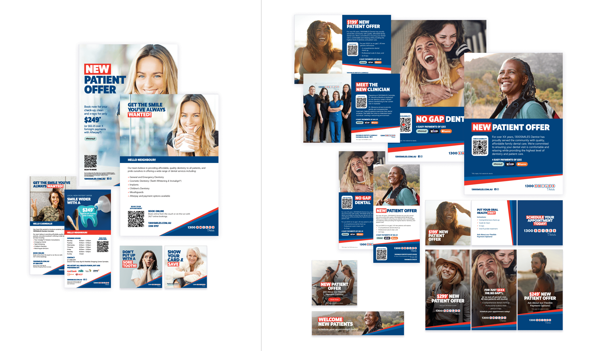
1300SMILES is one of Queensland’s most recognised dental brands, but after three decades, its marketing was falling flat. Campaigns looked sterile, disconnected from the diverse patients it served, and struggled to cut through against growing competition.
As Lead Internal Designer at Abano Healthcare, I directed the brand refresh across both 1300SMILES and Maven Dental. My role was to transform a dated identity into a campaign-ready design system, one that reduced rollout times, created instant recognition, and re-established 1300SMILES as a trusted, community-focused brand.
This work was led during my time as Lead Internal Designer at Abano Healthcare, where I was responsible for creative direction across both 1300SMILES and Maven Dental.
The Challenge
1300SMILES was a household name in Far North Queensland, but its brand was no longer performing at the level needed to support growth. Despite strong legacy recognition, the marketing system behind it was breaking down:
Campaigns relied on dated, generic visuals that didn’t connect with the diverse communities they served.
Rollouts were inconsistent and slow, with no scalable toolkit to support 30+ regional clinics.
The brand was beginning to expand beyond Far North Queensland into the wider state, but its dated identity limited cut-through in more competitive metropolitan markets.
The risk was clear: without a modernised identity and faster go-to-market execution, a trusted 30-year brand risked losing relevance, recognition, and the ability to expand successfully.

The Opportunity
The refresh wasn’t about making things “look better”, it was about preparing 1300SMILES for its next phase of growth. As the brand expanded from Far North Queensland into broader Queensland markets, the marketing team needed:
A consistent, campaign-ready design system that could scale across 30+ regional clinics and future locations.
Assets that resonated with everyday Australians - inclusive, human, and more in step with community values.
A visual identity bold enough to cut through in competitive metropolitan markets, while still protecting the trust built over 30 years.
By rethinking the identity as a strategic growth tool, the refresh created a brand that could not only maintain loyalty in legacy regions but also confidently expand into new territories.
Before
After
Results & ROI
The refresh transformed 1300SMILES into a scalable, campaign-ready design system that empowered the marketing team to work faster, communicate more clearly, and expand confidently across Queensland.
Return on Investment Highlights:
Faster rollouts → Campaign turnaround times were cut significantly, enabling faster speed-to-market.
Reduced costs → A reusable system lowered design production effort for future campaigns.
Stronger visibility → Bolder layouts and inclusive creative helped the brand cut through in competitive markets.
More effective campaigns → Flexible layouts supported detailed messaging, driving clearer communication of offers.
Scalable growth → Assets were adaptable across 30+ clinics, ensuring consistency at state level.
Before the refresh
The previous 1300SMILES campaigns leaned heavily on clinical stock imagery, minimal messaging, and overly safe layouts. While functional, they failed to reflect the vibrancy of the communities the brand served - and gave the marketing team limited flexibility to communicate detailed offers or adapt for multiple formats.
This lack of impact made it harder for campaigns to cut through in a competitive market, slowed rollout times, and risked eroding the strength of a 30-year brand legacy.

Acknowledgment
This brand continues to be owned and led creatively by The Marketing Factory. My role was to provide a fresh perspective and deliver a refreshed, campaign-ready system under tight timelines. It was a privilege to contribute to the evolution of such a well-recognised Queensland brand while supporting the client’s broader vision.


Rebecca Hollingsworth | Abano Healthcare
Mel is an incredible graphic designer that I’ve had the pleasure to work with for years now. Her quality of work is above and beyond what you can get through agency or a freelance platform. She's intuitive about design and creates fun, fresh projects that people love. She can bring an energy to any brand that makes them look modern, professional and exciting. On top of that she's a lovely person through and through, always a pleasure to deal with and receptive to your ideas. I trust her with designing brands from scratch as easily as I’d trust her with campaign execution. If your brand needs help or you just want it to ‘pop’ I can’t recommend Mel highly enough.